User journeys: a UX comparative study to support decision-making
Customer story: Air France KLM
The context: check-in page innovation
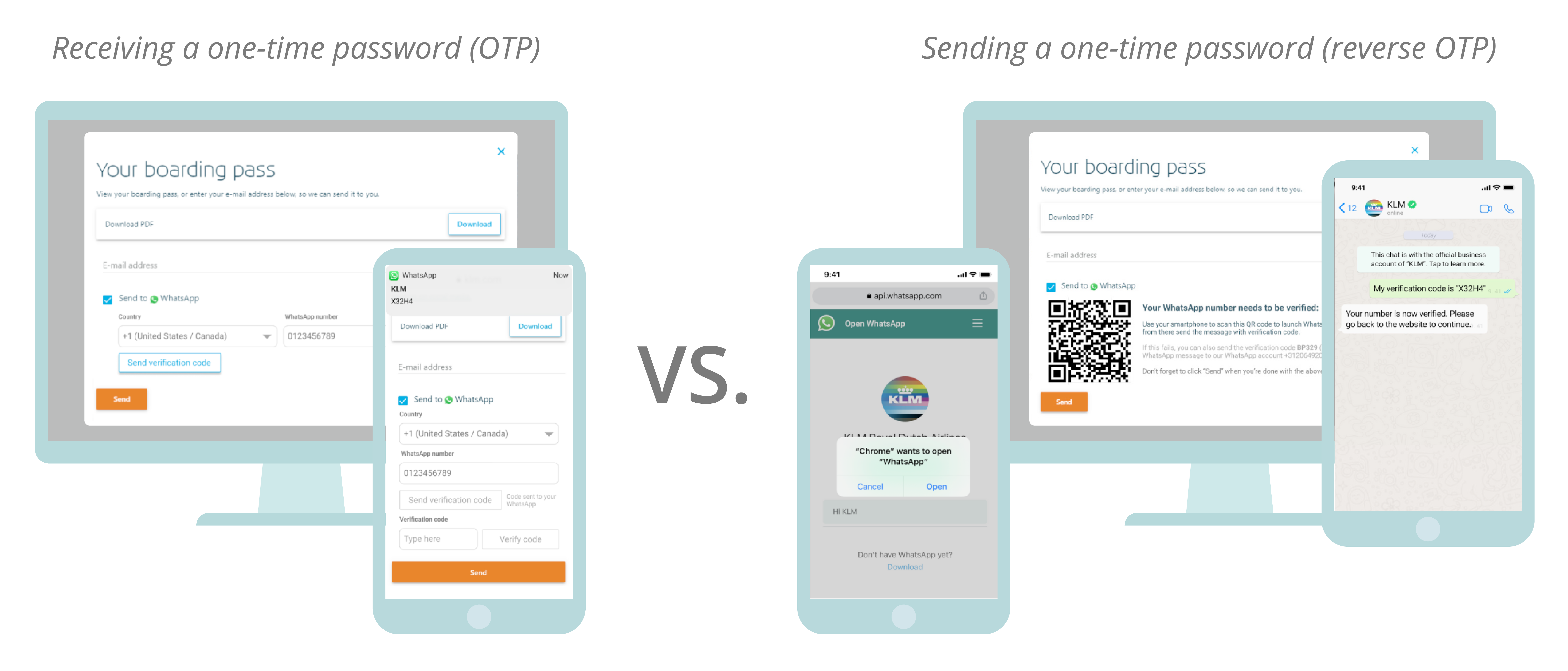
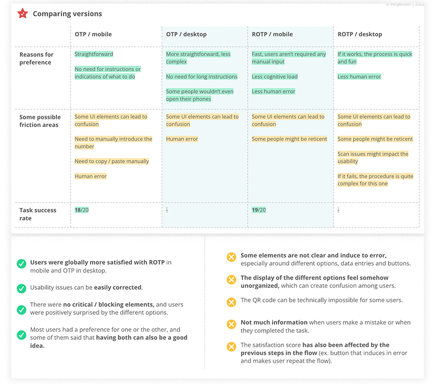
- In order to offer a new check-in option for their clients and in doing so increase the conversion rate, Air France developed two alternative journeys that they wished to study and compare by carrying out remote user tests internationally.
- The 2 new proposed journeys allow Air France KLM users the possibility to check in, download their boarding pass and receive notifications about their flight via WhatsApp. Version 1 - OTP: the user receives a one-time password (OTP) to validate the check in information. Version 2 - ROTP: the user sends a one-time password (reverse OTP) to KLM in WhatsApp to validate the check-in information
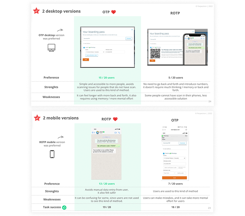
- Both of these new journey options needed to be tested on mobile and desktop devices


