See more customers

Creating a mobile application through design thinking

Customer story: Bip&Go

Innovating in the mobility apps market

  • Bip&Go, a subsidiary of Sanef group, sells subscriptions for the highway toll system Liber t. This offer gives drivers simple and quick access to the system. Bip&Go wants to increase their services while allowing customers to simply access their account through a mobile app. Furthermore, the marketing direction envisions drivers' expectations and needs about mobility in a broader way.
  • Bip&Go aims to invest more widely in the market, with new services for its current customers and also opening up to new targets.
  • The Bip&Go team is convinced that existing mobility apps are not fully covering customers' needs and asks for a better market understanding of the market.
Customer story: our UX research experts worked with Bip and Go teams to launch a new application through a customized design thinking method.

Research goals to launch the mobile app

  • Discover who is the core target for your product or service

    Understand users and their needs about mobility as broadly as possible while precisely identifying the different clusters of customers.

  • The design thinking allows to co-create your offer with your core users.

    Define the core target and create a MVP - or Minimum Viable Product - relevant with pre-identified expectations and needs.

  • User tests allow to evaluate navigation behaviours

    Deliver a beta version with an optimized user experience, meeting customers' needs.

A design thinking approach

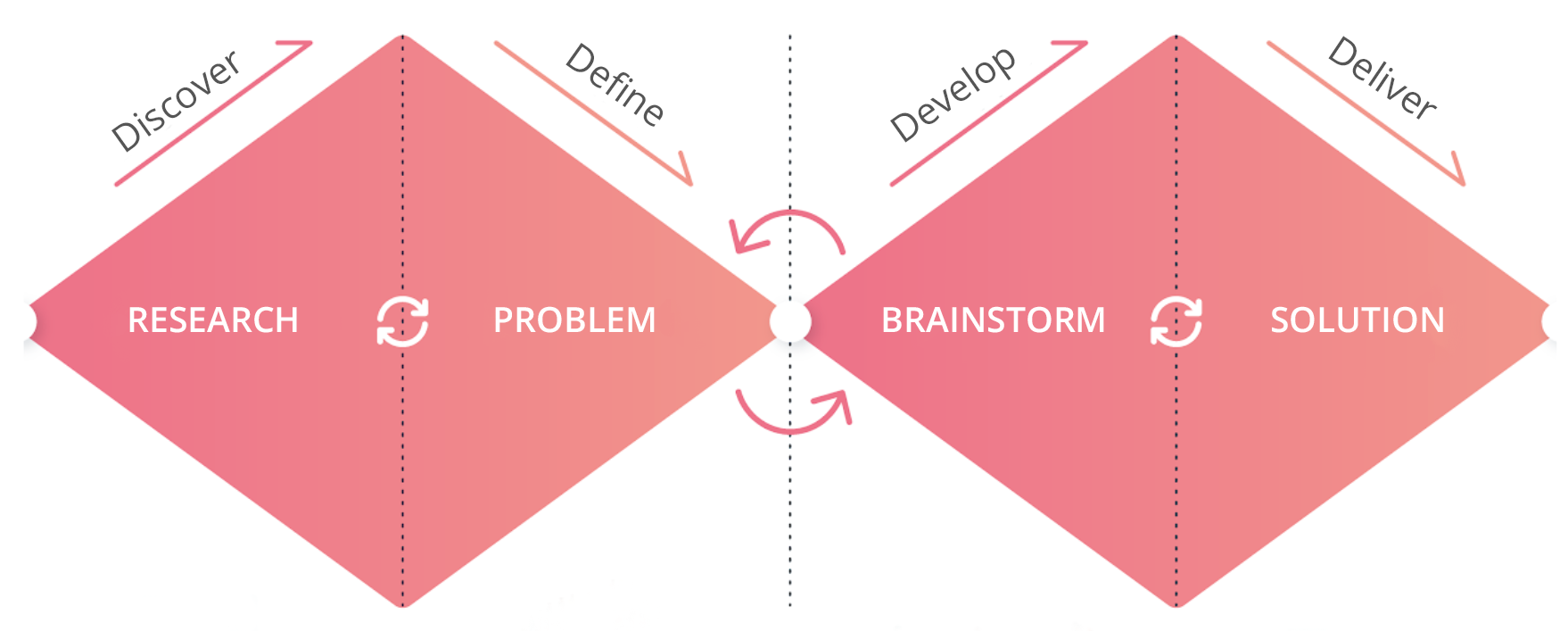
Our answer comes within the scope of a typical process of design thinking, with a combination of converging and diverging steps.

4 steps of design thinking method
  • UX research method: one to one interviews

    Phase 1: User interviews, conducted face-to-face and remotely

    Sample: 8 users

    Learn more

  • UX research method: quantitative survey

    Phase 2: Quantitative survey

    Sample: 800 respondents, representative of the French population

    Learn more

  • UX research method: focus groups

    Phase 3: Focus groups

    Sample: 19 users divided into 2 groups in Reims and Lille

    Learn more

  • UX research method: remote user tests

    Phase 4: Remote user testing the prototype

    Sample: 20 users aged 25 to 54

    Learn more

User-centric deliverables

The project spanned over several months through a collaborative effort between Ferpection, Bip&Go, and their development agency. Each method endeavoured to answer a specific question, while being informed by the results of the previous steps: why, who and how.

Discover: face-to-face and remote user interviews

Exploratory interviews allow us to better understand users, their habits, needs and frustrations.

Deliverables

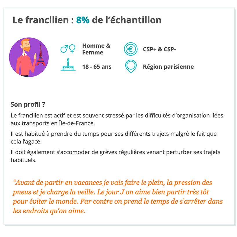
One on one interviews allowed 5 profiles to suface with specific needs, in order to focus on the customer knowledge during the design thinking process.

5 profiles that emerged during interviews
Each personae was deeply explored

Define: Quantitative survey

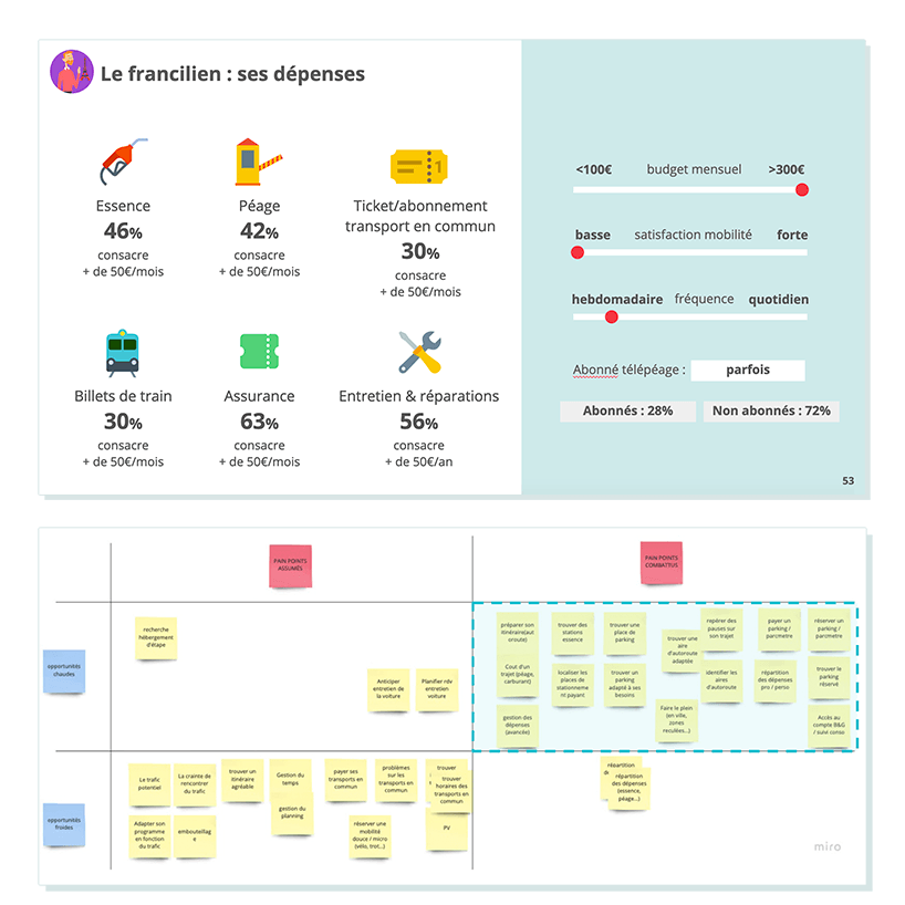
The quantitative approach allowed us to qualify each profile with more precision, verifying its relevance and potential, and finally its interest for the new offering.

Analysis of the results

The 5 pre-identified profiles were confirmed and turned into personae, each with their precise characteristics, travel behaviors and expectations in terms of the mobile application conceived by Bip&Go.

Prioritization workshop

Following the personae definition, this converging phase allowed us to identify main pain points to which Bip&Go could bring a reliable answer.

Develop: Focus groups

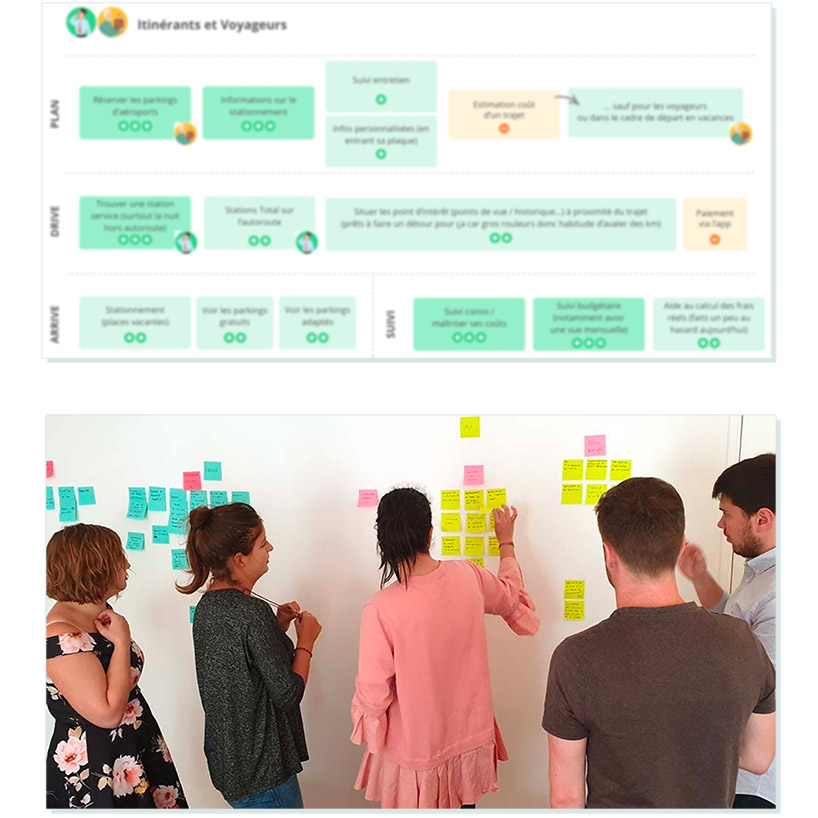
With focus groups, we could extend the design thinking method to co-create with users the mobile application MVP that they would really use.

Deliverables: executive summary and features for the MVP

  • Summary note of all topics discussed during the focus groups.
  • Prioritization of the features for the prioritized personae.
Future users create themselves their solution with features that are essentials to them.
The remote user test came to positive feedback and confirmed that the design thinking process was useful

Deliver: Remote user test with the prototype

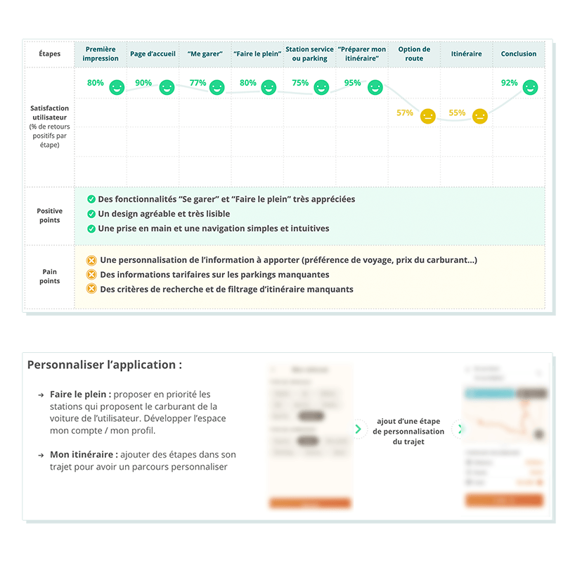
We conducted a first user test with the prototype of the app. This step was essential to check the mobile application still meets the identified expectations. Given the previous steps and the fact that Bip&Go has focused on users since the beginning of the project, the prototype was much appreciated. However, there were some optimization points, such as the way information was presented and app personalization.

Deliverables: analysis including strengths, weaknesses and UX recommendations

  • Analysis of verbatims coming from the remote user test, classified by steps and UX issues.
  • UX recommendations. With the results, our UX researchers could build personalized UX recommendations for the developement agency, who could in turn rework on and finalize the prototype.

Optimize your user experience and ensure your success

Bip and Go testimony about their experience with Ferpection Design Thinking

Bip&Go
"The design thinking approach suggested by Ferpection helped us understand our targets for the launch of the application, and to focus on the target with the most inteesting potential. We could also define precise personae and prioritize features to stand out from competitors like Waze. I am truly amazed with their execution: the understanding of our challenges, their overall methodology, their reactivity, the precise presentation of the results, the clear documentation. Ferpection didn't produce a superficial research. They came to us with tangible assets securing the launch of our mobile application."

- Bryan Body, Product Lead Bip&Go