See more customers

A comparative study to benchmark different subscription routes

Customer case: Crédit Agricole

The context: challenging the current chatbot trend

  • The Crédit Agricole Technologies and Services team wishes to work on a new subscription journeys for professionals.
  • Conversational interfaces, such as chatbots, are increasingly present in subscription journeys of the banking sector. "All agencies offer a conversational concept, all design sprints result in chatbot concepts, no matter what the business or user issue at stake is." (Marie Petit, User experience manager at Crédit Agricole Technologies and Services).
  • The extent of conversational writing is a broad and complex, it includes the following:
    • Human to human conversation with an adviser
    • The chatbot by writing with no restriction in requests powered by artificial intelligence
    • The chatbot with guided input and choices
    • A conversation-looking style guide and tree view (“comics bubble” appearance on the Q&A form)
  • The challenge was therefore to assess the relevance of a conversational approach to Q&A, in particular on an account subscription process. We chose to test and compare different options provided by competitors: a competitive benchmark was carried out by users.
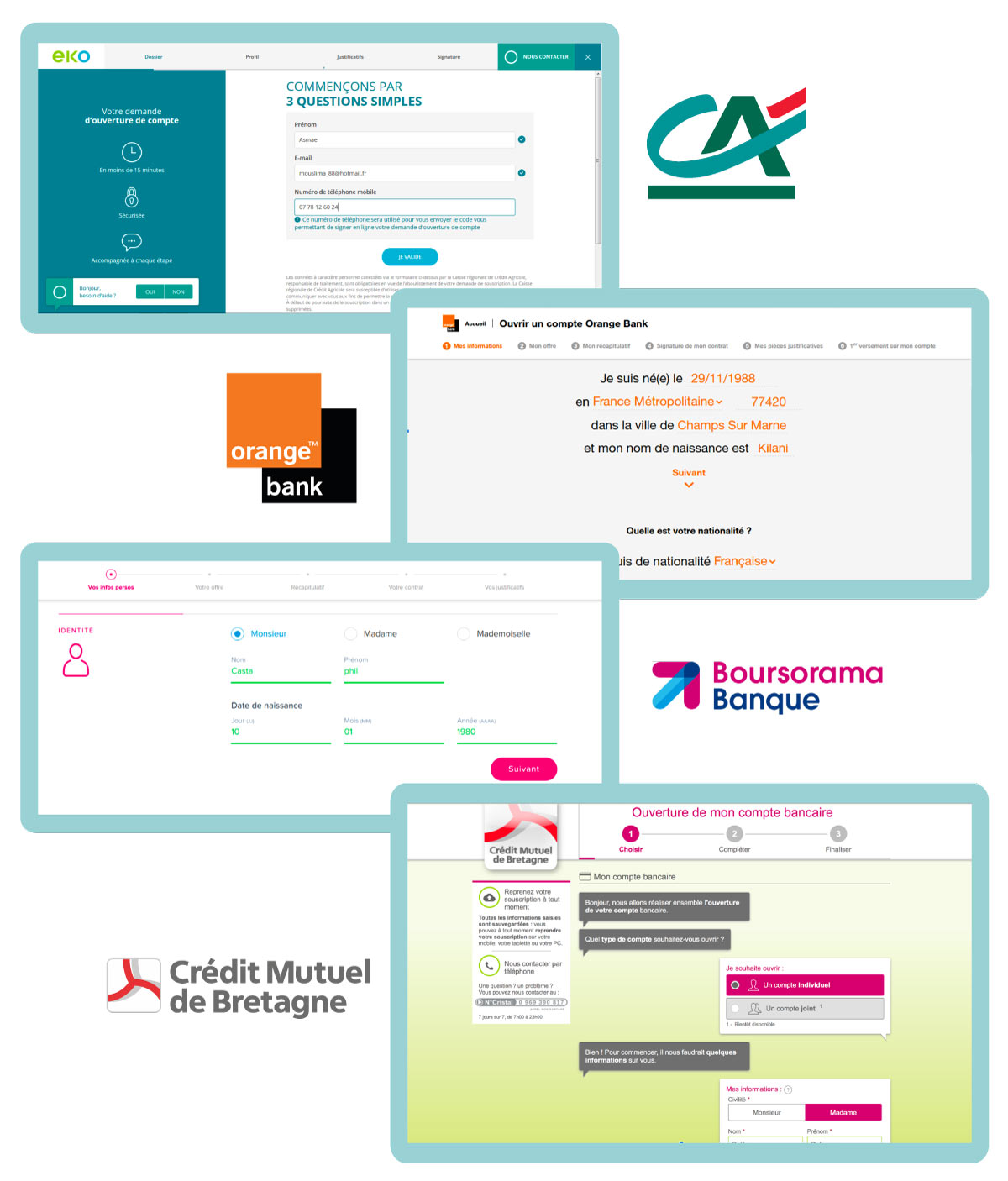
Comparative user test for a subscription process with chatbot and form for Eko

The mission: to analyze different subscription journeys

  • Comparative studies allow a qualitative benchmark

    Test 4 different account subscription journeys

  • Thanks to comparative tests you can compare users' perception

    Evaluate the user perception of each experience

  • Testers give a satisfaction score to each study

    Compare satisfaction levels throughout the journeys with a precise and distinct scoring system

  • You can identify the bread points of your competitors and be inspired by their successes

    Identify the strengths and weaknesses of each journey

Our approach: the qualitative comparative study

  • Méthode d'étude UX: Tests utilisateurs comparatifs

    UX method: Remote user test of 4 different subscription journeys

    • Boursorama
      Boursorama:
      Subscribe via forms
    • Crédit Agricole
      Eko:
      Subscribe via forms with access to a chat which uses both FAQ forms and human advisor
    • Orange Bank
      Orange Bank:
      Conversational journey with normal language forms
    • Crédit Mutuel de Bretagne
      Crédit Mutuel de Bretagne:
      Conversational journey with access to chat with a human advisor

    Sample: 60 users in total divided into 4 groups, i.e. 15 users per group

    General public with a majority of users aged 25-35, with an interest in banking services

    Learn more about remote user testing

Study process and deliverables

Comparative User Test: a rigorous methodology

  • For each group, the users try an experience and give their feedback on a first journey, then are invited to do the same on a second journey.
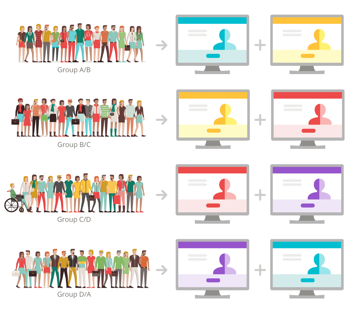
  • To reduce bias, one group tested A then B, another group B then C, and so on so to vary the order of presentation amongst testers and so reduce the anchor bias effect on results.
  • Users had to complete the enrollment journey from start to finish, from the home page of the website to the page summarizing their information.
Méthodologie pour une étude comparative
Livrables du test client mystère

Deliverables of the comparative study

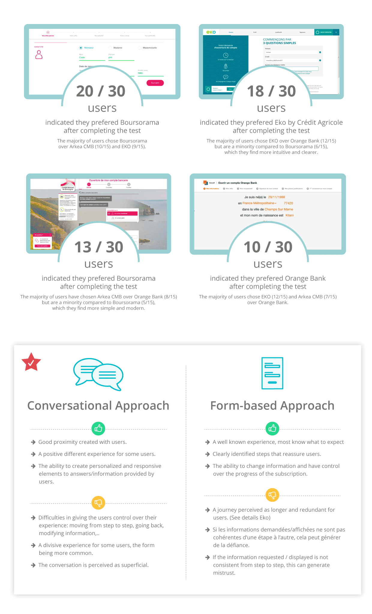
  • Overall, the feedback showed that conversational options are not always preferred. At this stage of technical maturity of the solutions, this medium of exchange is not unanimous with users and can be very divisive.
  • It is easier to implement a system of forms with good practices than to offer a satisfactory and efficient conversational option. It is much more challenging in simulated conversational solutions to give the user guidance or to manage error and back and forth by the users.
  • Beyond the form-based vs. conversational approach, the comparative study provided other valuable insights including:
    • It is preferable to divide the route into several steps and leave little choice at each stage to improve support and personalization.
    • Concern over hidden costs and liabilities remains a major pain point that can be addressed by working on reinsuring users.
    • Users can easily notice the difference between human to human conversation and a chatbot: there is no point in cheating, a chatbot does not have to imitate humans.

Optimize your user experience and ensure your success

Crédit Agricole’s Testimony about their experience with Ferpection

Crédit Agricole
"This study enabled us to identify good practices among 4 banking players and to have objective criteria for choosing between forms and conversational. Initially we had favoured a conversational approach for a warmer and more playful aspect. Finally, following the study, we switched back to classic forms and our efforts are focused on the sequences from one stage to the next."

- Marie Petit, User Experience Manager at Crédit Agricole Technologies and Services